Galower Build

My Client
Galower Build is a medium-sized construction company, working exclusively for architects on high-end projects in London and the south east.
My Contribution
I was invited to write the copy for Galower’s new website which was in the early stages of re-structure. Getting to the heart of this inspirational construction firm led me to into an initial piece of work: refreshing their brand identity and pulling everything together to give them a clear ‘road map’ to follow. (A prequel, if you like, to writing their web copy.)
The Galower Brand
My recommendation was for a refresh rather than a complete make-over. The brand identity simply had to reflect the Galower of today without implying that a major (eg negative) change to the organisation had taken place. Alarming loyal clients was not part of the plan after all. Galower, quite rightly, wanted to look like a professional builder to their architect clients – helping them achieve their vision through solid project management and construction principles. Equally important was reassuring residential and commercial property owners that their architect has a credible building partner on board. So, Galower Builders became Galower Build to reflect the status of the projects they undertake rather than the modest work associated with a smaller builder. The Vision & Values piece focused on meaningful and pragmatic statements relating to the relationship and experience that Galower achieves for its clients.
Corporate Identity
Designer Johnny Isaacs and I took a structural approach to the logo, focusing on a strong typeface and drawing attention to the ‘G’ of Galower. We also retained green as a major component of the colour palette. The resulting identity, across website, print, livery and signage, conveys the image that Galower Build is firmly focused on offering professional and skilled building services to architects – helping them secure and complete projects successfully while keeping the relationship between all parties positive and open.
Website
And so to the website – my original brief. Website builder Jason Congerton and I worked together to create an accurate reflection of Galower Build. The strategy of the content, therefore, was to communicate the work undertaken as well as the brilliance of the finished project – glimpses of the skillful process, attention to detail and consideration that’s synonymous with Galower Build. This is all about reassurance that Galower is a safe but forward thinking pair of hands.

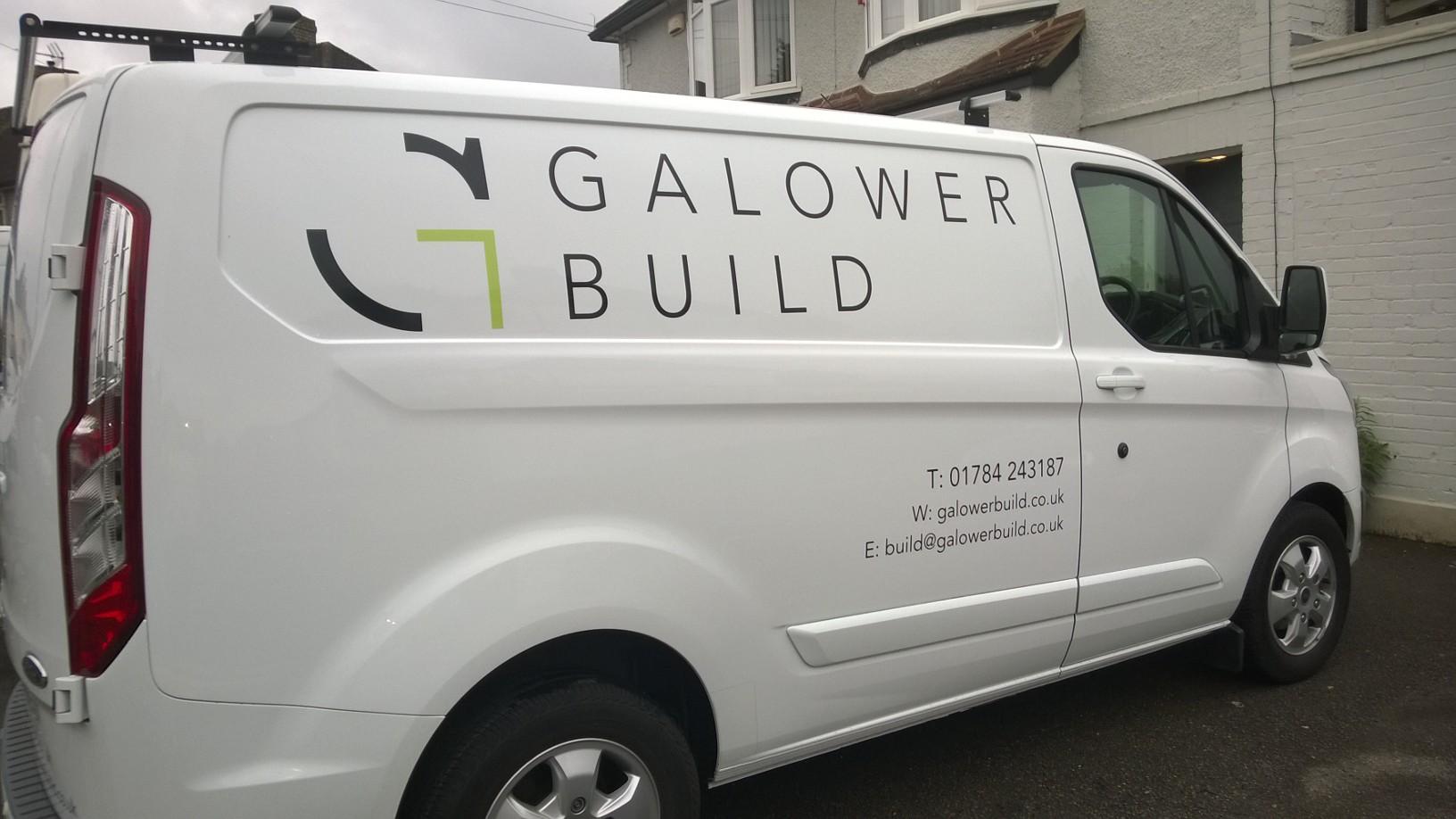
The rebranded vans help reinforce the high-end nature of their work

Imagery is a mix of professional photography, stock library and spontaneous smart phone shots.


Get in touch and let's see where I can help.
Call me on: 07702 204642
or email: open@parachutecommunication.co.uk
